Group Members
Video
Motivation
Needless to say, 2017 has been a turbulent year: nationalism, hate-crimes, xenophobic attitudes are on the rise and have become even more brazen. The infamous “Unite the Right” rally in the Charlottesville, VA sent shockwaves around the national stage, catalysed several difficult conversations, and escalated violence and the destruction of property. The term “Twitter Revolution” refers to the use of social networking sites by protestors and demonstrators to communicate civil unrest. Parsing data from Twitter (bytes of bigger conversations) can capture fleeting emotions and solidify networks within a subgroup. Social media in rallies has been cited as a potential model for the interactions that occur through conventional means. However, there is conflicting empirical evidence of the efficacy of the Twitter Revolution phenomenon.
In this project we attempted to codify and quantify the “Twitter Revolution” in Tennessee by using sentiment and network analysis. We analyzed tweets in a 50-mile catchment area surrounding Murfreesboro and Shelbyville during the Shelbyville White Lives Matter rallies and Murfreesboro Loves counter-protest from October 27 to October 29, 2017.
Objectives
- Identify primary networks of communication from October 27 to October 29, 2017
- Employ sentiment analysis to identify patterns in positive or negative content over time
- Assess discrepancies between the sentiment value of Twitter content through identified communication pathways and events that occur on the ground.
- Look at the sentiment score of each tweet and the network of interactions among Twitter accounts.
- Identify “key-players” in the communication network by using hub scores to identify the accounts with the highest degree of influence.
Data Methodology
Source
We first set out to see if people in Charlottesville who were actively tweeting during the event were collectively organizing and either influencing or reacting to the event through their content. However, due to limitations of Twitter’s API, we had to use another protest for the basis of our analysis.
Scraping
Using the twitteR package developed by Jeff Gentry, we accessed the Twitter Streaming API and obtained all tweets between 00:00:01 October 27, 2017 and 23:59:59 October 29, 2017. The data represents 65,955 different tweets from 22,209 unique Twitter accounts. To further simplify our analysis, we rounded time into 15 minute increments.
Cleanup
Stopwords, UTF-8 emojis, punctuation, replies (@), retweets, linefeeds, and URLs were removed from tweets using regular expression functions.
Analysis
Sentiment
Using the tidytext R package, we used the following data sets were used for the sentiment analysis:
-
afinn sentiments: this dataset assigns numerical values (ranging from -5 to 5) to words that carry positive or negative connotations. Words assigned -5 are deemed to be extremely negative, while words assigned 5 are deemed extremely positive. For example, “awesome” is assigned a 4, while “catastrophic” is assigned a -4.
-
nrc sentiments: this dataset groups assigns each word one or more general sentiments from the following list: surprise, joy, fear, anger, anticipation, negative, positive, trust, sadness or disgust. For example, the word “fun” is assigned the sentiments “joy”, “anticipation” and “positive”, while the word “horrible” is assigned the sentiments “anger”, “disgust”, “fear” and “negative”.
From our dataset of tweets, we used the afinn and nrc datasets (separately) to assign each tweet a sentiment(s), and then explore how the sentiments changed both quantitatively and qualitatively over time. In addition, building on the network analysis, we subsetted the tweets dataset by network neighborhood to explore the general sentiment for different neighborhoods over time.
Network
A large disconnected network formed between October 27th and October 29th. Focusing on the largest component of the graph, we discovered that a significant portion of those interactions occurred during Saturday, October 28th, with the highest rate of new interactions, represented by a new Twitter account interacting with a Twitter account already in the largest component, occurring on October 28th. This demonstrates that Twitter users are responding to the protests in real time. Using the same network, we identified the most active and influential accounts using centrality and hub score as our determining factors. These identified accounts were incorporated into the sentiment analysis as a comparative measure.
Data Visualization
Wordcloud
Sentiment Analysis
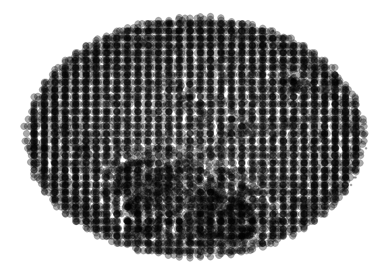 This is the overall network representing every Twitter account that was active and all the tweets that were posted from 00:00:01, October 27th to 23:59:59, October 29th. The largest connected component can be found at the bottom of the network.
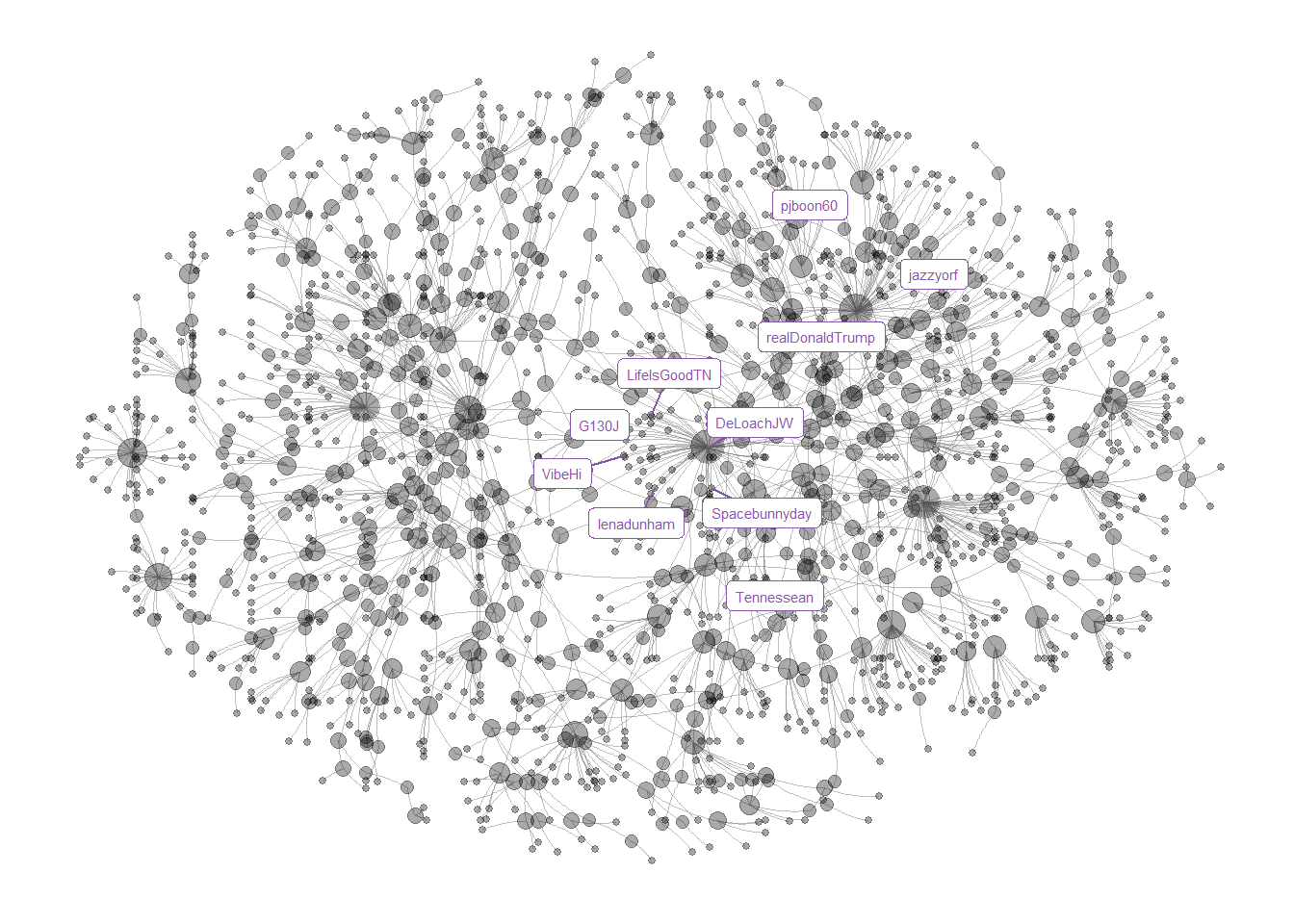 The ten largest hubs are shown on the network. An interactive plot with hub scores and account centrality can is shown below.
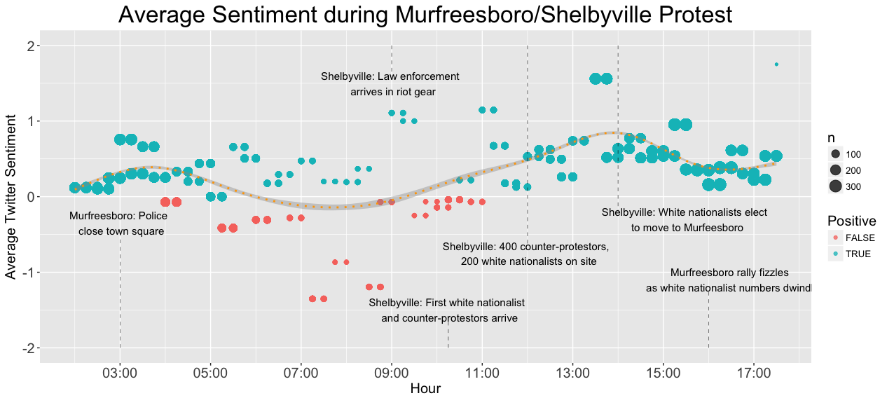 The average twitter sentiment throughout the day during the rally. The size of the points is proportional to the number of tweets in each 15 minute interval, and the color of each point indicates of whether the mean sentiment is positive or negative for that interval.
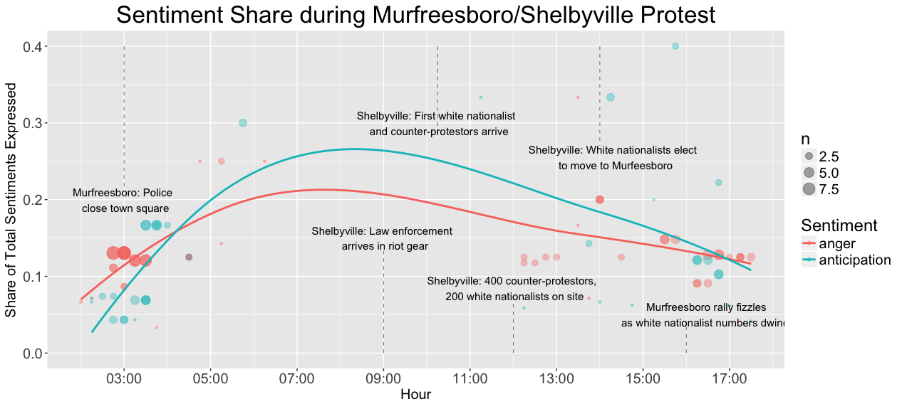 This plot shows the share of sentiments expressed that were classified as “anticipation” or “fear”. The size of each point is representative of the number of each sentiments expressed in that particular 15 minute interval for both anticipation and fear. A clear increase in the share of anticipation and fear sentiments is seen in the early stages of the Shelbyville rally, and a similarly dramatic decrease is seen as the second rally in Murfreesboro dissipates.
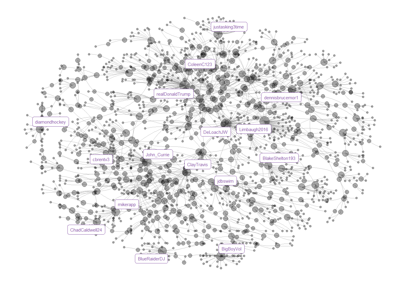 The sixteen most active users are shown on the network. Their activity was determined by the number of connections made between them and other accounts within the network. Content involving these accounts can is below.
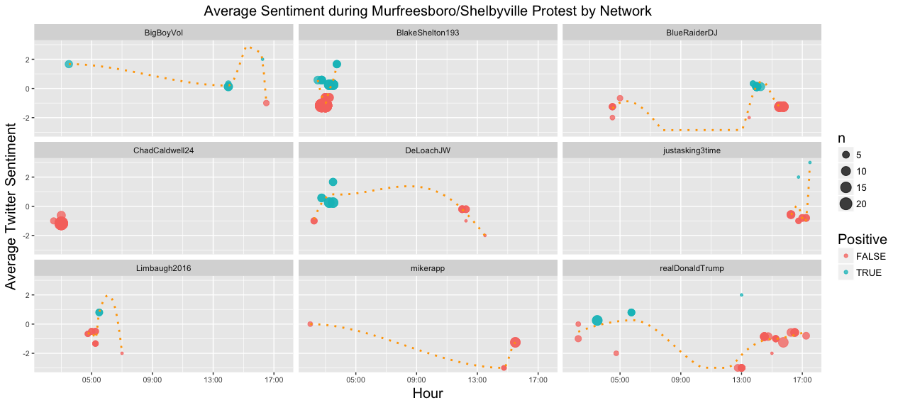 Again the average sentiment over time is plotted against time. However, the dataset is reduced to those tweets that were part of the largest network neighborhoods based on user interaction (tweets and/or replies). The plots are then faceted by network neighborhoods and fit with loess curves to examine the change in sentiment for each neighborhood over the course of the day
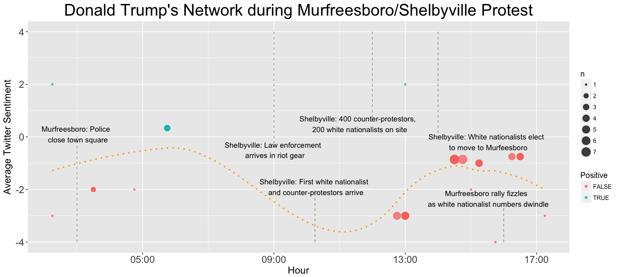 This plot represents the average sentiment of the persons tweeting in Donald Trump’s twitter network during the White Lives Matter rally. Interestingly, the sentiment if highest before the first rally in Shelbyville, and lowest when the Murfreesboro rally fails to manifest, which contrasts the general trend seen in the plot of all twitter users in the Murfreesboro/Shelbyville area.
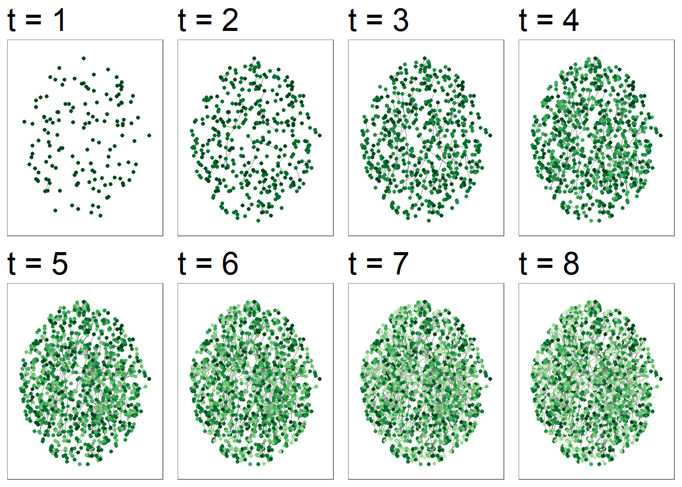 The graph is sparsely connected up until the fifth time frame. By the seventh time frame, very few new accounts are beginning to interact with the network. Previously previously participating Twitter users are almost exclusively interacting with those in the network where a plurality of those users began participating over the course of the 28th of October, or the day of the protest. This tentatively supports the Twitter Revolution theory.
Comparitive Measures
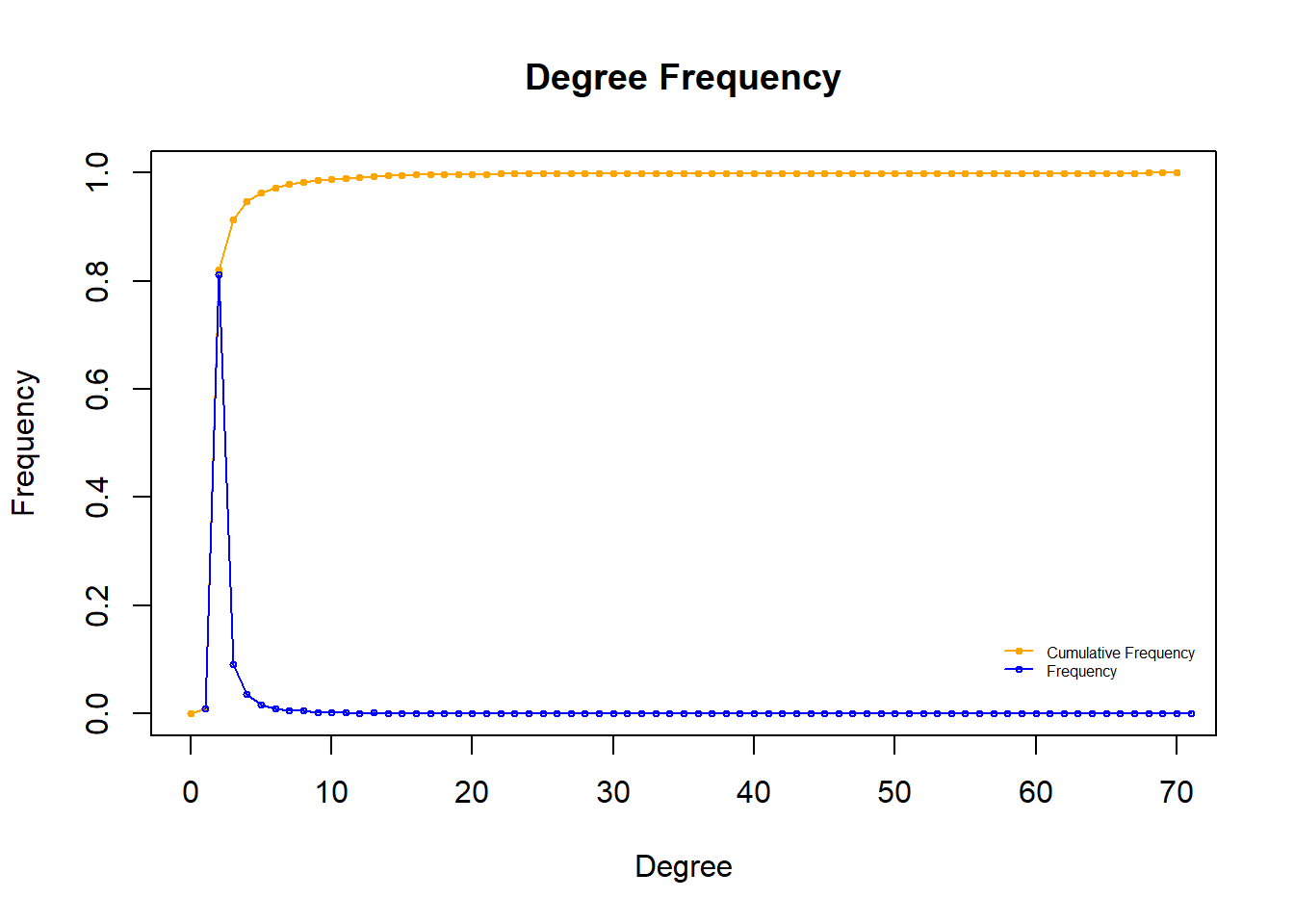 The degree distribution of the overall network shows both the cumulative frequency and frequency of each possible value of degree. The degree distribution approximately follows the power law which supports our description of the network as scale-free.
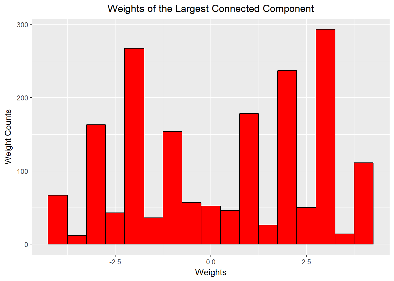
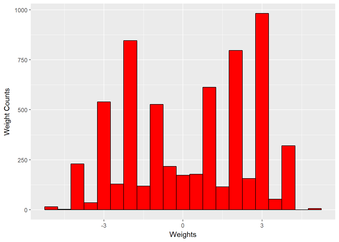 This distribution represents sentiment score of a connection in the whole network to the distribution of weights in the largest connected component. In both instances we observed bimodal distributions with peaks at three and negative three, but the histogram suggested that the largest connected component had slightly more negative weights.
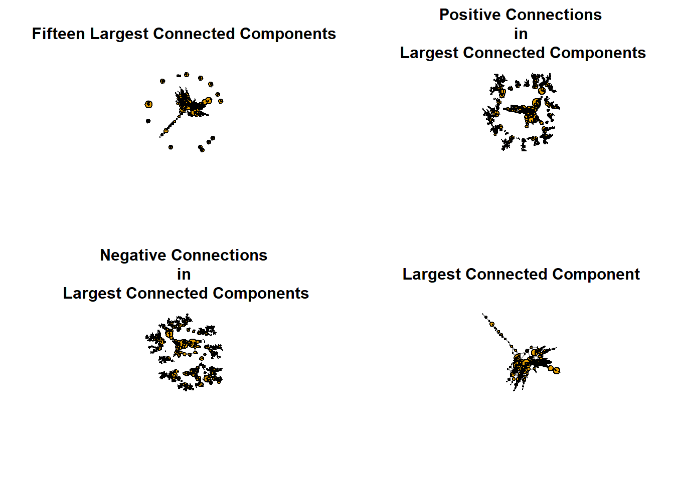 Similarities are shown among the fifteen largest components. Subsetting the fifteen largest components into positive and negative interactions preserves the structures of the network. We then show the largest connected component which is the focus of our study.
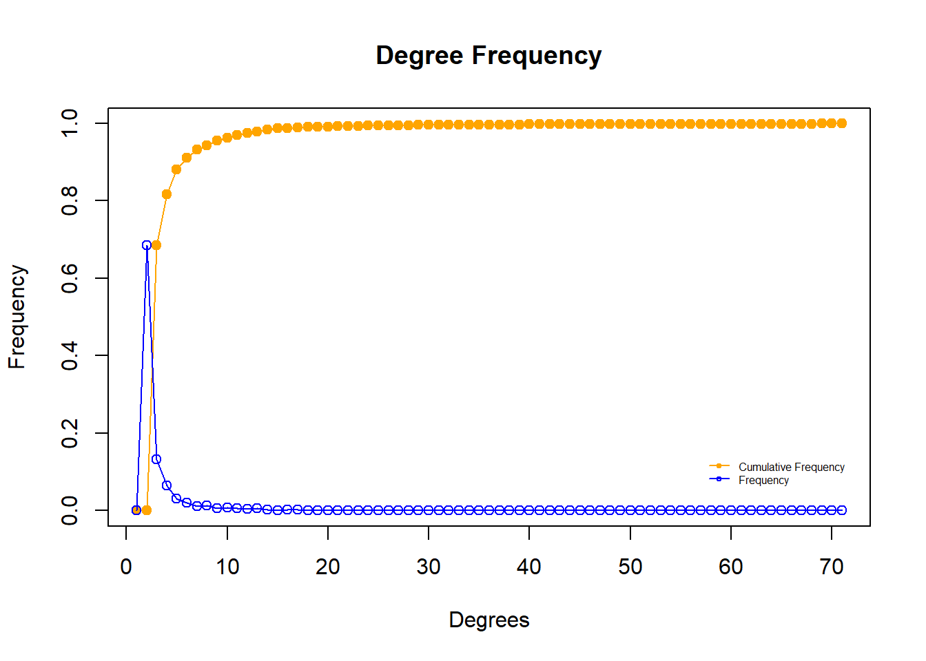 The degree distribution of the largest connected component shows both the cumulative frequency and frequency of each possible value of degree. The degree distribution approximately follows the power law which supports our description of the largest connected component as scale-free. We do not see any departure from the trend in overall network. A full breakdown of the centrality in this component is below.
Even greater detail on the total number of interactions between unique pairs of Twitter users can be found below.
We also show a subgraph of another component in the overall network.
Main Findings
- Due to the variety of content, it was difficult to categorize tweets into groups based on verbal content. Instead we used sentiment analysis to quantify tweets. Other considerations were given to location within the catchment area, but spatial data was not precise enough to allow for sentiment analysis by location.
- Social networks are complex systems that can evolve indefinitely. Treating the interactions between Twitter accounts in the greater Murfreesboro/Shelbyville area as a single large network was impossible due to structural holes amongst thousands of components, many of which represent only a single pair of Twitter users. Instead, focusing on the largest connected component yielded some useful insights.
- The largest connected component contained eighty-three percent of the Twitter accounts and eighty-six percent of connections within the filtered network and preserved many of the topological features
- Sentiment analysis of twitter data aids understanding of the general attitudes of users, but its functionality is limited by its lack of contextual flexibility. For example, the word “confederate” carries a negative connotation in the context of the White Lives Matter movement, yet the nrc sentiment dataset assigns “confederate” the sentiments “positive” and “trust”.
- Juxtaposing the time trends of sentiments for twitter users (both overall and separated by network neighborhood) in the Murfreesboro/Shelbyville area with the timeline of occurrences on the ground provided insight into the general online response to actual events in real time.